ApplFLab Guided Tour
This page gives an introduction to ApplFLab, by making an example custom component and highlighting the component editor of ApplFLab.
The reader is expected to have basic knowledge of VisualWorks.
Last revision: January 22, 1997.
Contents:
The Component Editor
 Supplying General Information
 Painting the User Interfaces of the Component
 Setting up the Pages in the Component's Properties Tool
 Painting the User Interfaces of the Properties Tool Pages
 Supplying Painting Information and the Component's Palette Icon
 Putting the Component on a Palette
- Installing the Component in the System
In the following we will use an example to demonstrate ApplFLab's capabilities. Consider a file selection component. It is a component that enables the user to select a file (e.g. for opening it) or a directory (e.g. for saving it). We will refer to this two functionalities with the "get/put" behaviour of the file selector. We will give the file selector user interfaces that look like the standard Macintosh "get file" and "put file" dialogs (the latter without the name entry field).
The component editor is the central tool of ApplFLab. It is used to create a new components. Besides the obvious things like the component's user interface, the component editor requires the component designer to supply all the necessary information to let the component play its role in the environment.
The component editor's user interface consists of a notebook, of which each page is used to edit different aspects of the component. Currently there are six pages. The component designer typically works through the pages from left to right and then installs the component in the system.
On the page the component designer has to enter the user interfaces that can be used for that component. The designer can choose to use already existing user interfaces, or create new ones. The actual references to the user interfaces are filled in by the component editor when the designer paints the user interfaces on the next page.
The figures below show what the page looks like before and after painting of the user interfaces for the file selector component.

Figure 1a: Specifying which user interface to use.

Figure 1b: Page 1 after installation of the user interfaces in step 2.
The page consists of several subpages, one for each user interface of the constructed component. In our example, there are two, as we specified in the previous step. On each subpage a user interface can be painted in the same way we paint user interfaces with standard VisualWorks.
For our file selector, we put the following user interface components on the first canvas: a pop-up menu that represents the nesting of the current directory, a list that contains the contents of the current directory, a button indicating the volume of the current directory (selected and without label in the figure below) for returning to the parent directory, a button to display the available volumes and a button to open a selected directory or file.

Figure 2a: Painting the first user interface.
We use the standard install method to install this user interface. After installation the first page of the component editor will list this user interface by name (class name and spec selector) See figure 1b.
We do the same for the second interface for the file selector component, after adding a button to create a new directory (the button without label in the figure below, the label is created at runtime of the file selector).

Figure 2b: Painting the second user interface.
The page is used to specify the slices of the properties tool for the constructed component. By default there are four slices: basics, details, color, and position. On this page slices can be added, removed and respecified. The user interfaces of the slices are painted on the next page.

Figure 3: Specifying which properties tool pages to use.
For our file selector, we keep the default slices, and move on to the next page.
This page contains subpages that hold on to the user interfaces of the slices. Painting is done as always, except that defining aspects and installing the user interface is not necessary; it is done automatically by the component editor (when you press the install button, see step 1.7.).
The visual appearance of the file selector is parameterized with several properties:
- By making the label of the get/put button a property, we can later reuse the file selector in several contexts with another get/put button label, e.g. "File In" for a file-in tool, or "Extract" in a decompression application.
- The file selector can be used to get or to put a file, hence the 'For Put' check box. When the selector is in the get state, it lists all files (unless they are filtered, see below) and directories in the currently viewed directory. When a file is selected, the get/put button's label changes to the text entered for the get/put button's label property. When a directory is selected, the label changes to 'Open'. When the selector is the put state, it only lists the directories in the currently viewed directory. The label of the get/put button changes to 'Open' when a directory is selected, or to the text entered for the get/put button's label property when no selection is made.
- The file selector needs an aspect property to store the selected file when in the get state, or the selected directory when in the put state.
- Another aspect property is required to hold the current selection, or nil when no selection is made. Applications that reuse the file selector can process the value of this aspect, e.g a file-in tool could display the contents of a selected file.
- A filter can be specified. It is the selector of a one-argument method, taking a Filename and returning a Boolean indicating whether the given Filename should be displayed in the directory contents. Using a filter is useful when searching for specific files, such as '.st' files in a file-in tool. Filtering is disabled when no filter is specified.
- Since we painted two interfaces for the file selector in step 1.2, a property holding the selected user interface is needed.
On the "Basics" slice, we put two aspect fields, by dragging them off the "Properties" palette, a palette that contains user interface components that can only be painted on properties slices. The aspects of this aspect field are the names of the properties that will hold on to the models of our file selector (i.e. a ValueModel on a Filename). We call them "filename" and "selection" (not shown in the figure). For the filter, we place an action field, also taken from the "Properties" palette. The components for the other properties are dragged off the standard palette: an input field for the get/put button label, and a check box for the get/put behaviour.

Figure 4a: The "Basics" page of the file selector's properties tool.
On the "Details" slice, we put two radio buttons for selection of the user interface for the file selector.

Figure 4b: The "Details" page of the file selector's properties tool.
On this page, two things need to be specified: the default size of the component when is is dragged off a palette, and the icon that represents the component when placed on a palette.
In our example, we fill in 200 and 80 as the default width and height of the file selector, and we paint an icon as shown in the picture.

Figure 5: Supplying painting information.
The page is used to install the constructed component on a palette. Let's put the file selector on a new palette called "Files".
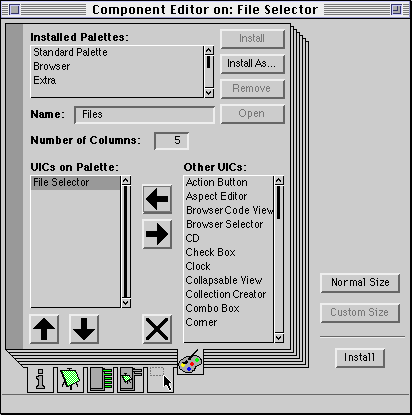
Figure 6: Putting the file selector component on a palette.
After all the previous steps, the component is installed into the system. This is done by supplying the name of a specification class.

Figure 7: User-defined component installation dialog.